1968
Nike was founded by Phil Knight in the year. The name of the brand was originally not Nike, but ‘Blue Ribbon Sports’ (BRS).
Early 1971
The brand name did not have enough appeal and Phil Knight decided to look into a possible change. Jeff Johnson, the company's first employee, suggested the name NIKE, a name that refers to the Greek goddess of Victory, who is depicted as a young woman with wings, running at great speed.

Spring 1971
La tarea era complicada: diseñar un logotipo que fuese imagen de marca y que superara las rayas de Adidas. Las propuestas de diseño, se basaron en las alas de la diosa griega. Las presentación la realizo ante Knight y el equipo de NIKE, compuestos por Jeff Johnson y Bob Woodell los cuales eligieron la imagen icono que hoy todos conocemos, pero esta decisión no estuvo exenta de polémicas.
Knight quería un diseño que sugiriera movimiento y al principio no estaba de acuerdo con el logo, pero como no tenía tiempo y necesitaba elegir un logo para las cajas que estaban esperando para ser impresas, terminó usándolo diciendo: “No estoy enamorado del logo, pero me voy a acostumbrar”.
But the real headache for Phil Knight was the symbolism of the three lines of adidas, which at the time was the only recognisable icon in world sport.
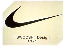
A new logo had to be created to continue the progress of the newly re-founded company as Nike. Nike's small board of directors gave the task to 35 graphic designers, from which design student Carolyn Davidson of Portland State University was chosen.
The task was a tall order: to design a logo that would be a brand image that would go beyond the Adidas stripes. The design proposals were based on the wings of the Greek goddess. The presentation was made to Knight and the NIKE team, made up of Jeff Johnson and Bob Woodell, who chose the iconic image we all know today, but this decision was not without controversy.
Knight wanted a design that suggested movement and at first he didn't agree with the logo, but as he didn't have time and needed to choose a logo for the boxes that were waiting to be printed, he ended up using it saying: ‘I'm not in love with the logo, but I'll get used to it’.
1972
Once the logo had been accepted and everything made official, the designer was paid the agreed remuneration for the work. For the time, for being a design student and a qualified designer, and for the short time occupied, Carolyn Davidson was well paid at $2 an hour, which amounted to a total of $35.
1978
Nike was growing to the point that there were several changes of headquarters in order to adapt to the company's ever-increasing size. At that time, the company took the opportunity to make slight changes to the logo by modifying the typography of the letters:
1982
Phil Knight contacted Carolyn Davidson and gave her a gold and diamond ring with the logo.
She also received a diploma from Knight and an envelope full of Nike shares as a thank you and bonus for her work.
How many shares remains a closely guarded secret between Knight and herself. ‘The shares were split three times since I received them, so I can definitely say that I have been very well compensated for my design,’ says Davidson. ‘You have to remember also that this was something special enough for Phil to do, because I billed him and he paid that bill.’ Carolyn retired in 2000 to pursue hobbies and volunteer work in hospitals.
1985
The logo is now represented on a coloured background, a small variation more oriented to brand image than to the evolution of the logo as such.
21st Century
The NIKE Swoosh has become so popular and iconic worldwide that it can afford to remove the NIKE lettering and keep just the symbol, which is the way we see it today on all of the American brand's apparel and advertising promotions.
In addition to turning the logo into one of the icons with the highest positioning, Nike has created brutal advertising campaigns in all the sports in which it is involved. Among its most representative phrases and one that shows very clearly what Nike has been all these years is undoubtedly JUST DO IT.
A slogan that motivates people to keep moving and always go forward. Something that Nike has never stopped doing in all these years.